
Eco Plus
Objective
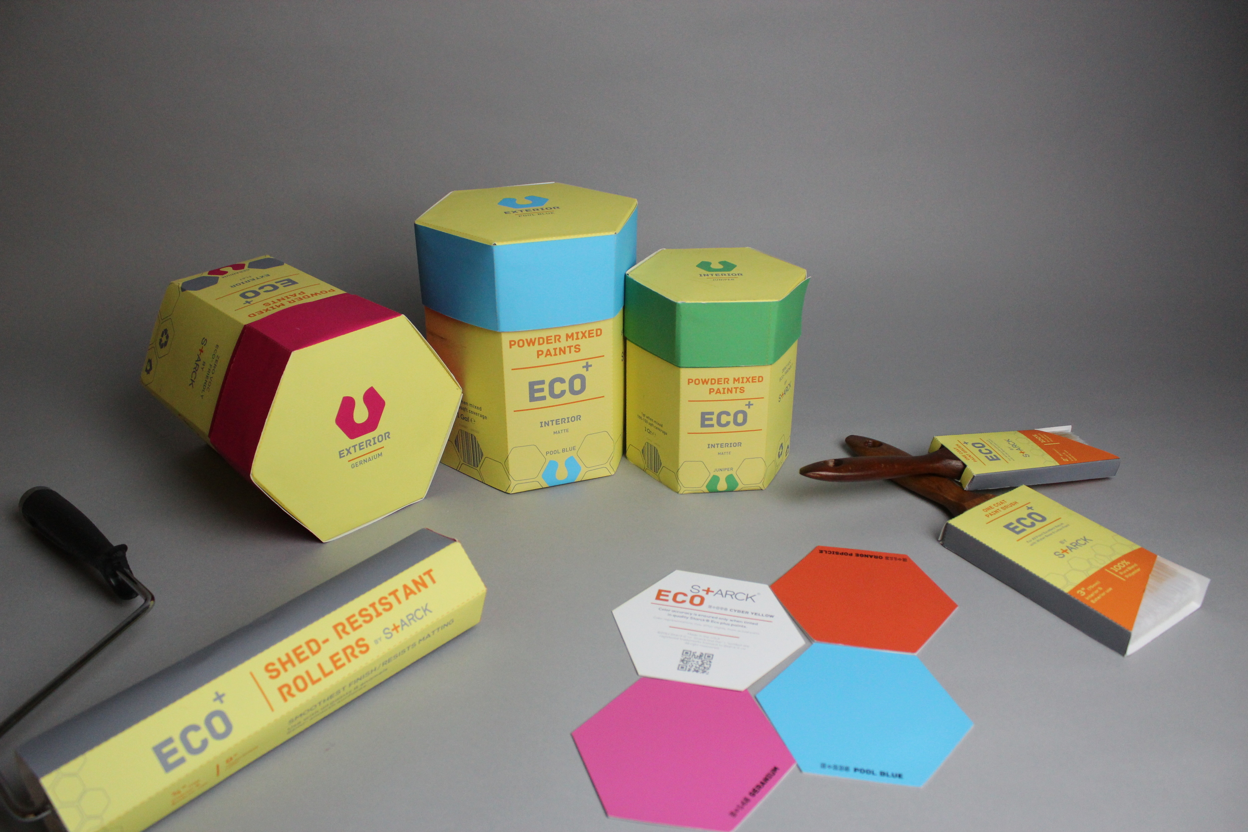
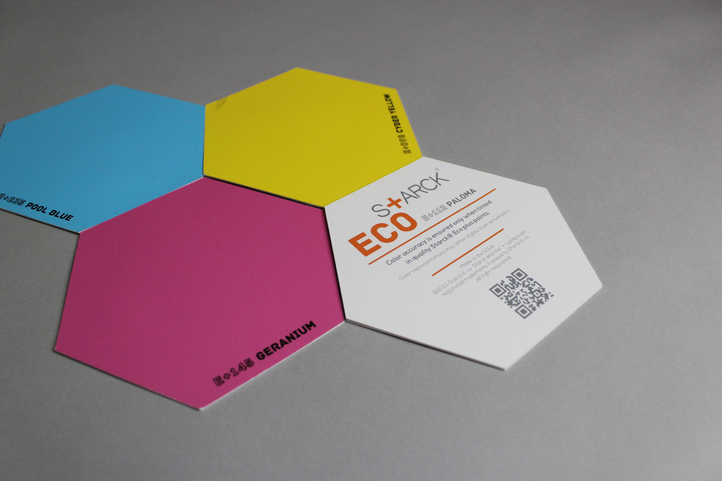
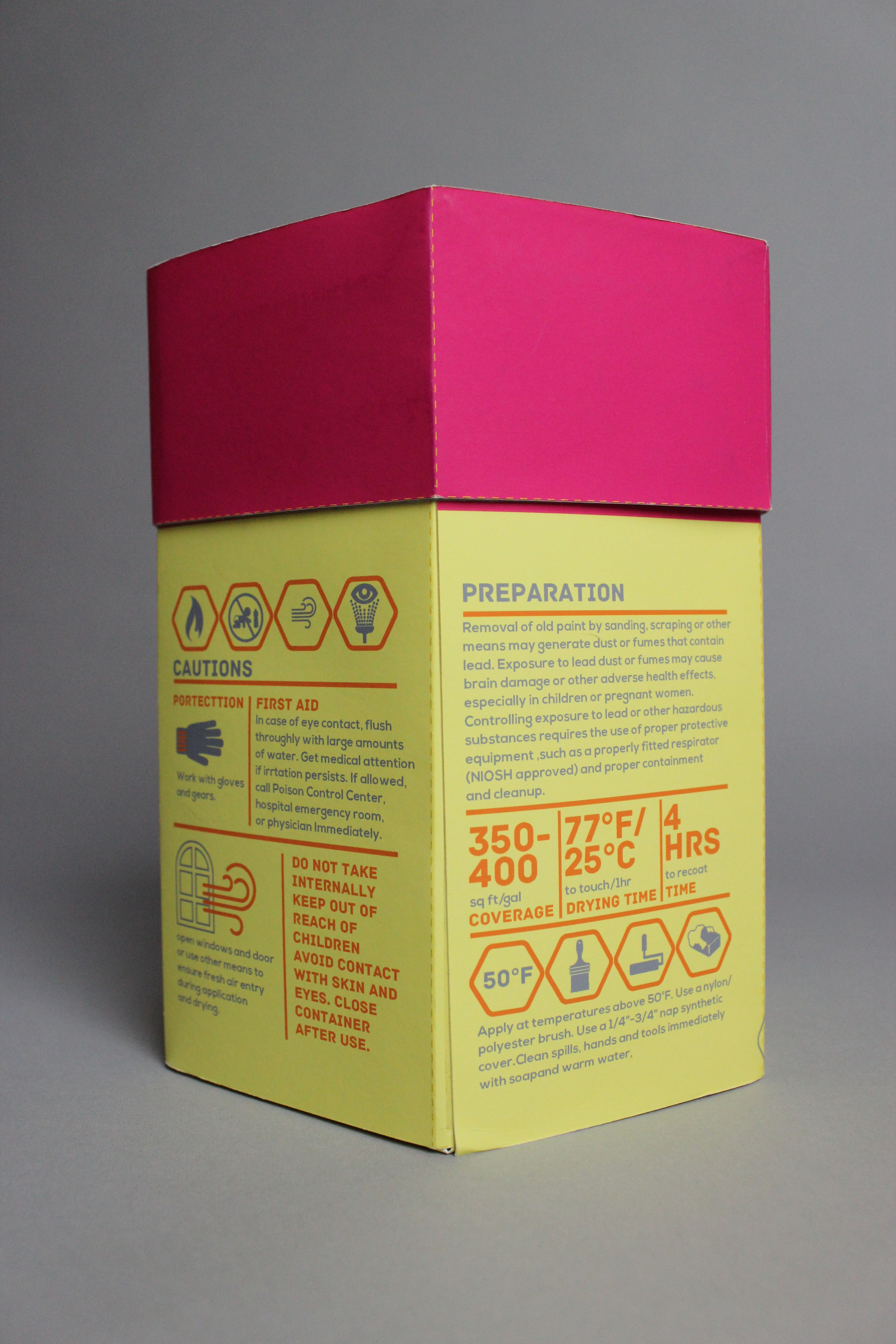
While on the path for developing the senses, such as taste, designers need to have the ability to critique each other’s work. Designers need to understand what is good and absorb it in order to cultivate their own styles. This course was a packaging class. Its purpose was to design the packaging of a powder paint collection to include containers, brushes, swatch cards, and other accessories. Instead of using metal and plastic, we had to use sustainable materials to design it.
Description
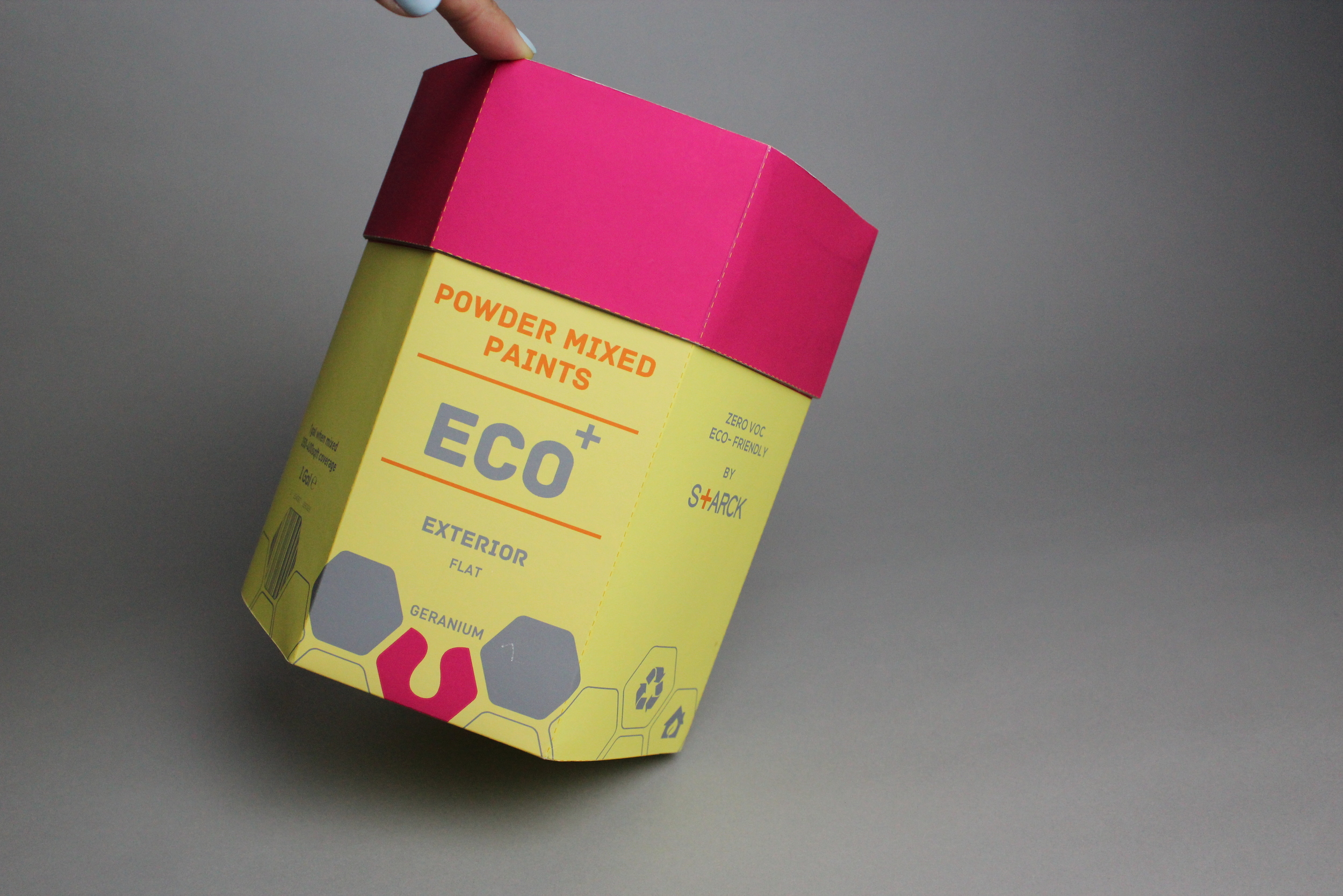
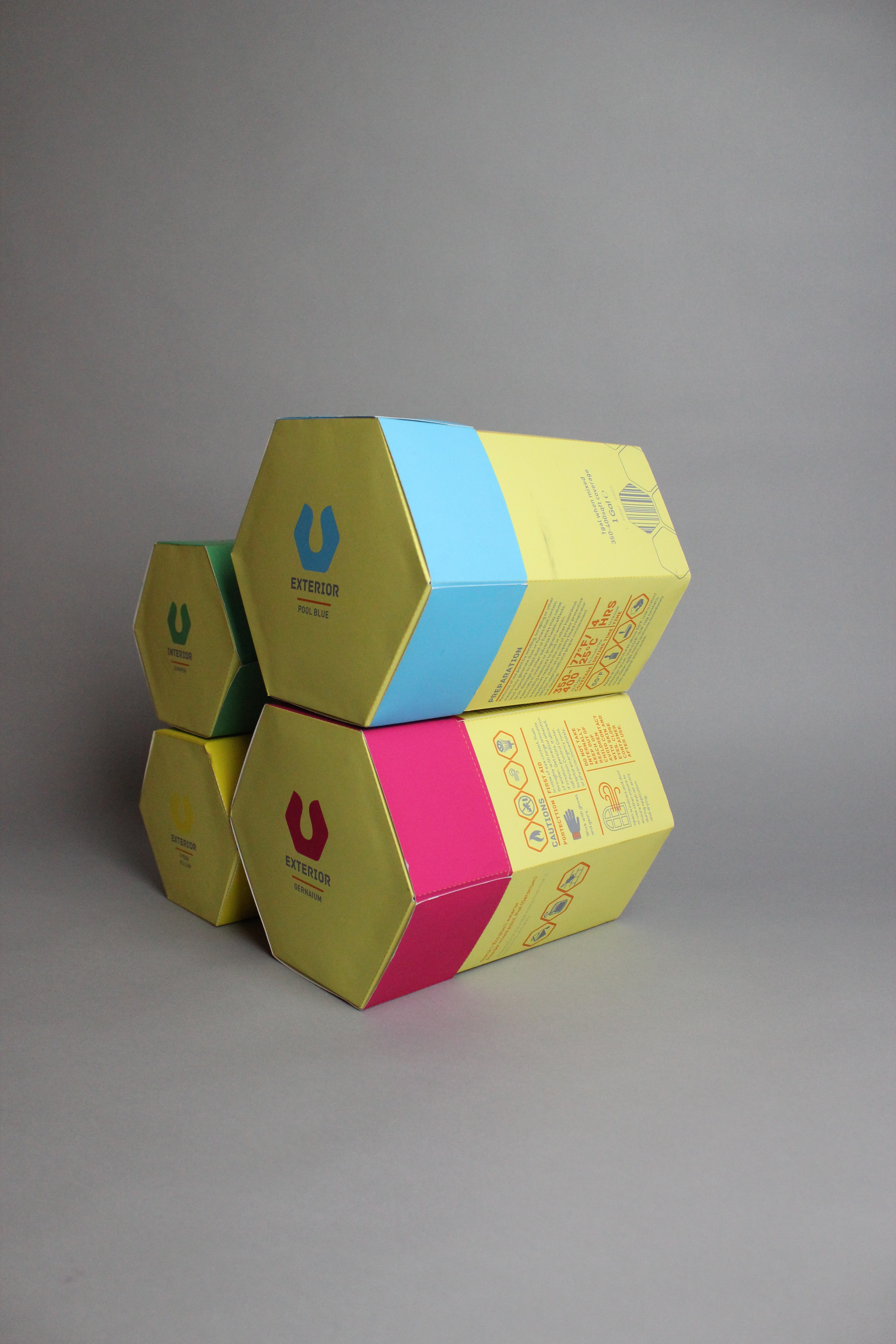
This project tried to approach the structure and material use of the product, so I picked a designer to establish the style of my design. Philipp Starck, an interior and architectural designer, has his own product line. The trending issue of environmental protection gave him a chance to start a powder paint collection with uses for interiors and exteriors. The concept of Eco Plus was inspired by the way bees collect flower pollen and turn it into honey. Bees use this honey to build their houses just like powder paint is used to decorate houses with a natural, organic, and sustainable result. The graphic elements on the packaging were borrowed from Philipp Starck’s “identical +” sign while the structure of the powder paint was a hexagon. The resulting packaging was also easy to stack and display.